Sparklines are a great tool that you should try out if you haven’t already. A sparkline is a tiny chart in an Excel worksheet cell that provides a visual representation of your data. With sparklines, you can take a “bloated” Excel chart and stuff it into a single cell. You can use this cell to spot trends in your data.
How to Create Sparklines in Excel
You simply insert sparklines next to the data you want to visualize. Sparklines only take up a small amount of room and can display a trend based on adjacent data in a clear and compact graphical representation. Although it’s not mandatory for a sparkline cell to be directly next to its underlying data, it’s a good practice to follow.
Step 1: Select an empty cell or group of empty cells where you want to insert one or more sparklines. On the Insert tab in the top ribbon of your Excel spreadsheet, in the Sparklines group, click the type of sparkline that you want to create: Line, Column, or Win/Loss.
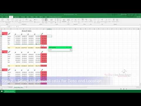
Step 2: Select the desired cells for Data and Location (or In the Data box, type the range of the cells that contain the data on which you want to base the sparklines).
Step 3: Now, you can customize your sparklines. Apply a color scheme to your sparklines by choosing a built-in format from the Style gallery. Select a single sparkline or a sparkline group. To apply a predefined style, go to the Design tab, in the Style group, and click a style. Or, you can click the arrow at the lower-right corner of the box to see more styles. You can also use the Sparkline Color or Marker Color commands to choose a color for the high, low, first, and last values (such as green for high, and orange for low). There are many ways to customize your sparklines.
You can quickly see the relationship between a sparkline and its underlying data—And when your data changes you immediately see the change in the sparkline as well.