Great Tips and Tricks from your local Microsoft professionals.
Our team came across this handy video showing how to make robust charts and graphs with Microsoft Excel 2010. We get a number of questions on how to use graphs in Microsoft Excel so we thought we would share this awesome video with you on how to best create and design graphs and charts in Microsoft Excel 2010.
Watch the video below.
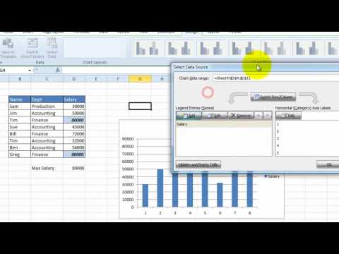
This tutorial from ndigilabs shows how to add a chart in Microsoft Excel 2010. The tutorial walks you through an example of a creating a bar chart but you can choose the chart that suits your needs. It also shows how to change the chart design, layout and format. You will learn to add or edit the chart legends, add or remove grid lines, change the style of information displayed on the horizontal and vertical axis. This tutorial also covers the placement of data labels within the chart. An example of adding a trend line is also shown in this Excel 2010 tutorial.
We hope you find this information useful in your day-to-day Microsoft Excel 2010 use. As your trusted Microsoft Partner we want to make sure you have the right information to do your daily job functions easily.